
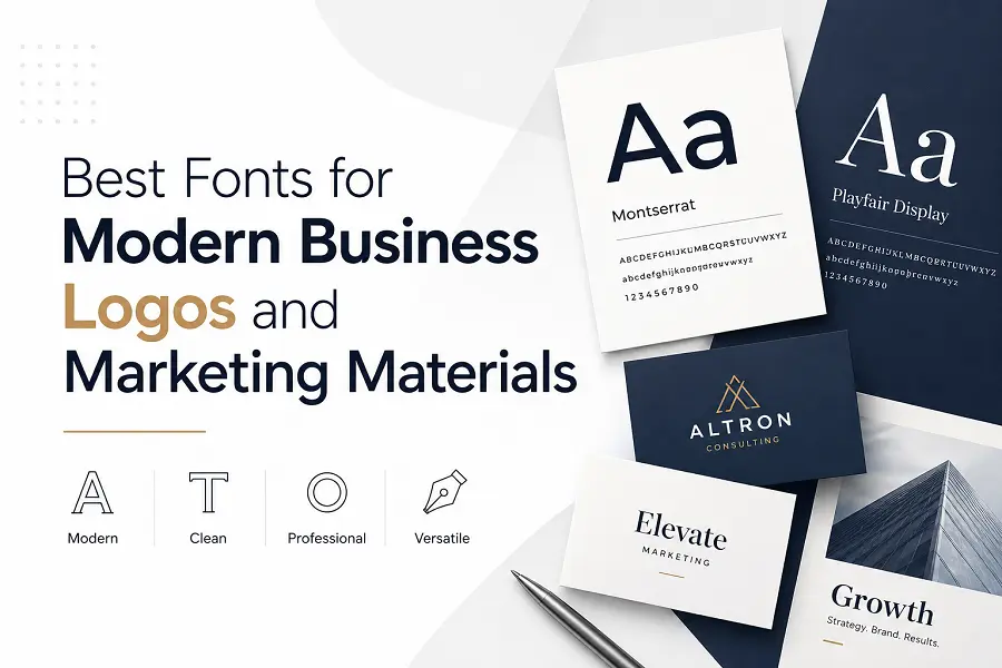
Typography speaks before your words are even read. In visual branding, the typefaces you select dictate how audiences perceive your company’s professionalism, values, and authority. A well-chosen font establishes immediate trust, while a mismatched style can alienate potential clients.
Selecting the perfect typeface requires understanding the psychological impact of different letterforms. Whether designing a corporate logo or assembling marketing collateral, choosing a cohesive font ecosystem ensures your message remains clear, memorable, and impactful across all mediums.
Essential Font Categories for Contemporary Brands
Different typeface styles convey distinct brand personalities. Understanding the primary classifications allows you to select a style that aligns with your specific industry and target audience.
-
Geometric Sans-Serif: Characterized by perfect circles and clean, linear lines, these typefaces project a highly progressive, minimalist, and tech-forward corporate image.
-
Humanist Sans-Serif: These styles feature slight stroke variations inspired by handwriting, offering a highly approachable, friendly, and empathetic aesthetic suitable for customer-centric businesses.
-
Modern Editorial Serifs: Featuring dramatic contrast between thick and thin lines, these fonts evoke an aura of luxury, high-end sophistication, and timeless elegance.
-
Neo-Grotesque Typefaces: Known for extreme simplicity, uniform stroke widths, and neutrality, these options deliver ultimate clarity and uncompromised readability on digital platforms.
-
Industrial Slab Serifs: With thick, block-like horizontal edges, these fonts communicate immense strength, structural stability, and creative confidence.
Strategic Process for Pairing and Implementing Brand Fonts
Building a professional brand identity involves combining different weights and styles to create harmony. Using too many varied typefaces creates visual chaos, while using too few can make marketing materials look flat and uninteresting.
-
Establish a Clear Hierarchy: Assign a dominant, high-personality font exclusively for your logo and major marketing headlines to grab immediate attention.
-
Select a Highly Legible Workhorse Font: Choose a clean, secondary sans-serif with multiple weights (light, regular, medium, bold) to handle dense body copy and subheadings smoothly.
-
Audit Multi-Platform Scalability: Verify how the letterforms render on small mobile screens, large print banners, and low-resolution backgrounds before finalizing your choice.
-
Evaluate Negative Space Within Letterforms: Ensure the open counters—the spaces inside letters like “o” and “a”—are wide enough to prevent the text from bleeding together at smaller sizes.
-
Test Contrast Against Brand Colors: Examine the font weights against your corporate color scheme to guarantee total compliance with global web accessibility standards.
Aligning Typography with Specific Industry Identity
Matching a typeface to your business sector prevents mixed signals. For instance, a financial institution relies on stability, making classic serifs or structured neo-grotesques ideal for inspiring client confidence. These shapes convey a long-standing heritage and meticulous attention to detail.
Conversely, creative agencies and lifestyle brands benefit from softer, rounded geometric fonts that evoke warmth and inclusivity. Software startups routinely favor ultra-clean, low-contrast sans-serifs that look crisp on app interfaces. By choosing typography that naturally mirrors the core characteristics of your industry, your marketing materials automatically feel authentic and relevant to your market.
Conclusion
The right typography functions as a silent ambassador for your business. By selecting scalable font families, maintaining strict visual hierarchy, and matching letterform psychology to your industry identity, you can build a cohesive brand that resonates powerfully across both print and digital media.
FAQs
What is the ideal number of fonts to use in marketing materials?
Stick to a maximum of two distinct font families. Use one unique typeface for prominent titles and logos, and a secondary, highly legible typeface for all supporting body copy and descriptions.
What makes a font look modern for a corporate logo?
Modern fonts emphasize simplicity, balanced geometric proportions, and clean lines. They generally avoid excessive decorative flourishes, focusing instead on structural clarity and sleek, uncluttered letterforms.
Can a business use a free Google Font for its official logo?
Yes, many open-source typefaces offer exceptional design quality and full commercial licensing, making them perfectly safe and highly effective choices for professional brand development.
Why do serif fonts perform well for luxury marketing?
Serif fonts feature traditional strokes at the edges of letters that mimic classic stone carvings and calligraphy. This historical connection evokes feelings of prestige, heritage, and premium craftsmanship.
How do I prevent text from looking blurry on digital marketing graphics?
Always select typefaces with generous spacing between characters and clean vector outlines. Avoid ultra-thin or overly intricate script styles, which tend to pixelate on standard mobile displays.